The Sourceworx Brand
Your Partner in Performance — a promise of limitless potential, continuous growth, and enduring excellence.
Sourceworx : Your Partner in Performance
Sourceworx is more than a technology provider — we are your partner in performance. At the heart of our identity is the infinity-infused X in our logo, a symbol of limitless potential, continuous growth, and enduring excellence.
The 2026 marketing strategy marks our transformation from technical vendor to trusted business partner, committed to delivering measurable results that drive your success.
Our approach is collaborative, results-orientated, and innovative, building capabilities rather than dependencies.
The Three Brand Pillars
We are Accountable
We do not consult and leave. When technology breaks, we fix it — because it is our responsibility. Accountability is not a value we aspire to. It is the operating model.
We Understand South Africa
Load-shedding, B-BBEE requirements, POPIA, MFMA reporting cycles — these are not obstacles we navigate around. They are the conditions our solutions are built for.
We Make Technology Perform
Performance is the outcome we are paid to deliver — not uptime statistics, not SLA reports, not feature lists. The measure of our work is whether the client's organisation performs better because of us.
Structural Credentials — Back Claims, Never Lead With Them
Brand in the Wild
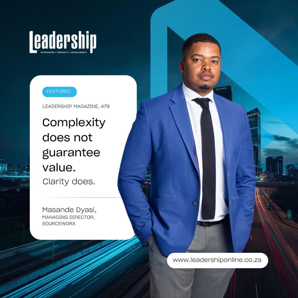
4K+ followers and growing, the Sourceworx brand communicates authority, approachability, and performance at every interaction.
The tagline "Your Partner in Performance" is not a slogan. It is a contract. Use the full phrase in formal contexts. In confident, established contexts, let the word Performance stand on its own.
Mission & Vision
The global coordinates of the Sourceworx brand — the anchor that never changes.
Accelerating Growth
Across Africa
To accelerate growth and establish the African continent as a leader in innovative, efficient, and sustainable business practices through strategic technology adoption.
The Brand Tagline
"Your Partner in Performance."
This is not a slogan. It is a contract. Use the full phrase in formal contexts and first introductions. In confident, established contexts, let the word Performance stand on its own.
Brand Essence
"We are the partner that makes technology deliver on its promise — reliably, accountably and in the context of South Africa."
This statement must live inside every communication we produce.
Logo Usage & Placement
The Sourceworx logo is the Seal of Quality. It must always be displayed with integrity, never distorted or rotated.
Vertical Logo
Best for narrow spaces like posters, social media posts, and vertical signage.
Horizontal Logo
Preferred for wide formats such as headers, banners, and website navigation.

Logo Mark (Favicon)
Ideal for app icons, favicons, and small-scale applications.
Dynamic Scaling Guidelines
Desktop Header
Min. 180px width — horizontal logo
Scroll State / Mobile
Collapses to Favicon mark in pill navbar
Print Materials
Min. 25mm width — maintain vector source
✓ Do's
- Always maintain clear space equal to the "X" mark height on all sides
- Scale proportionally — never stretch or compress
- Use approved colour versions only
- Ensure sufficient contrast with background
- Use light logo on dark backgrounds
- Use dark logo on light backgrounds
✗ Don'ts
- Never rotate or flip the logo
- Never add drop shadows or effects
- Never use unapproved colour variations
- Never place on busy backgrounds without sufficient contrast
- Never crop or mask the logo mark
- Never redraw or recreate elements of the logo
Brand Colours
Executive Energy — always use specified HEX, RGB, and CMYK values.
Primary Brand Colours
Follow the 60–30–10 distribution rule to maintain the colour hierarchy across all brand touchpoints.
60% Base Colour
Midnight Blue
#00213F
R0 G33 B63 · C100 M48 Y0 K75
Primary backgrounds, main headings, body text, and dominant brand elements.
30% Support Colour
Azure Blue
#009BDF
R0 G155 B223 · C100 M31 Y0 K13
Subheadings, secondary graphics, dividers, and supporting visual elements.
10% Pop Colour
Sky Blue
#20BCED
R32 G188 B237 · C86 M21 Y0 K7
Call-to-action buttons, highlights, accents, and key focal points.
Supporting Brand Colours
Whites and greys provide balance, breathing space, and sophistication.
Typography & Font Guidelines
Consistent typography reinforces our professional identity and ensures readability across all platforms.
Sharp Grotesque Medium 20
Main titles, page headers, primary emphasis to command attention and establish hierarchy.
Your Partner in Performance.
Sharp Grotesque Book 20
Section titles, secondary headers, and organisational structure.
Technology that works for Africa.
Inter Regular
Paragraphs, descriptions, and all extended reading material. Min 16px.
We combine deep technical expertise with strategic business insight, translating complex solutions into tangible performance improvements.
Inter Light / Thin
Tags, badges, captions, navigation items, and supporting metadata.
MANAGED IT SERVICES · SOUTH AFRICA
Accessibility Mathematics (WCAG 2.2 AA)
#0F172A on #FFFFFF
#FFFFFF on #00213F
16px body / 14px labels
Imagery & Photography
Visual content that reflects innovation, professionalism, and dynamic energy. Curated, expensive, and intentional.
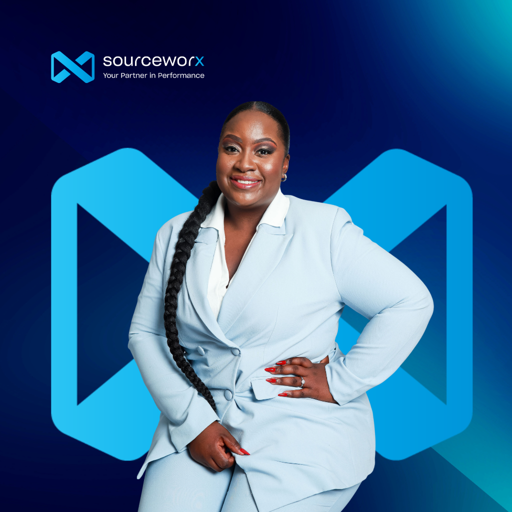
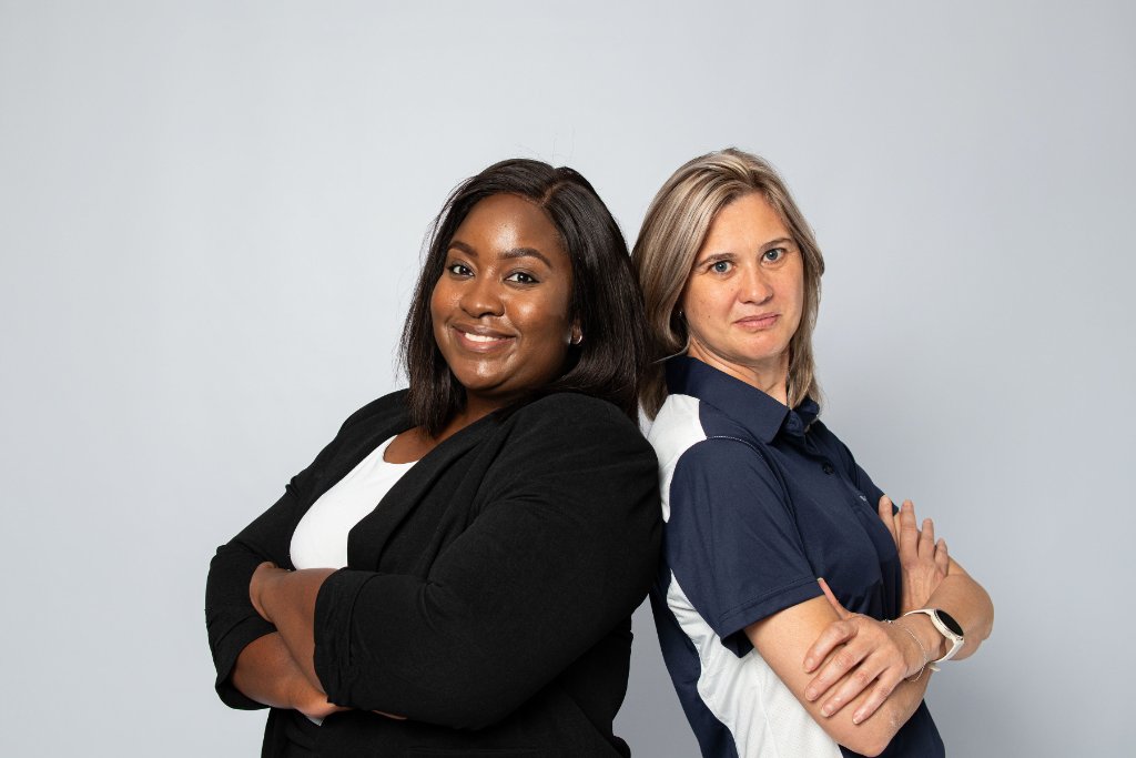
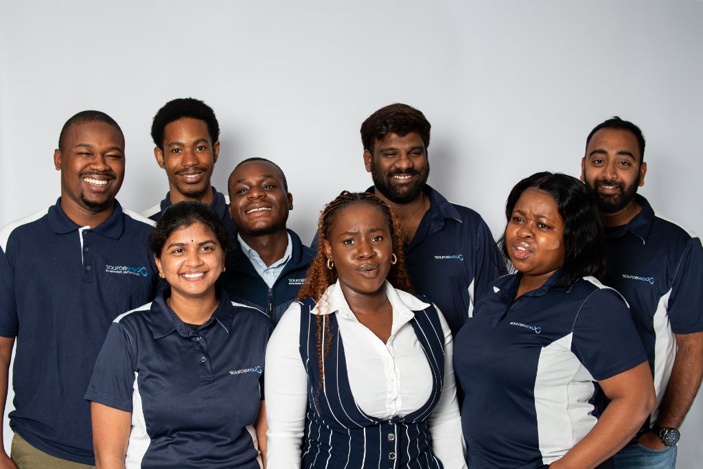
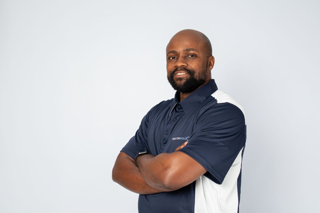
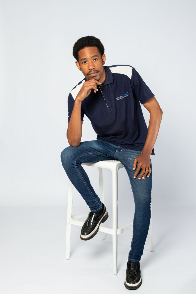
Brand Photography
Real Sourceworx team photography — authentic, high-production studio portraits and brand imagery.
 AI Assisted
Ads & LinkedIn Post Designs
Branded post templates and ad designs — approved layouts for LinkedIn, social media, and digital campaigns.
 LinkedIn Post
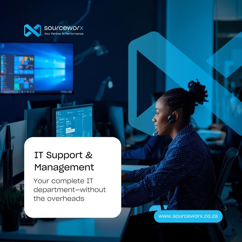 LinkedIn Post
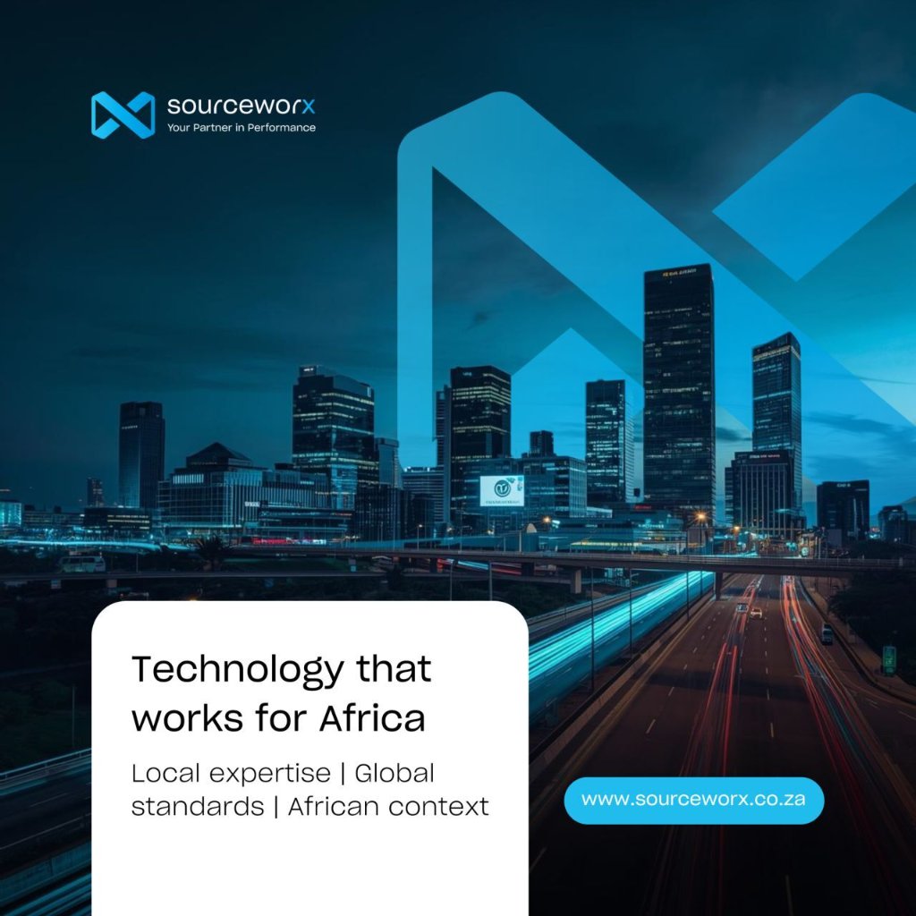 Ad Design
Design Do's & Don'ts
Visual examples of correct and incorrect Sourceworx design execution — what to follow and what to avoid.
Do This — Approved Execution
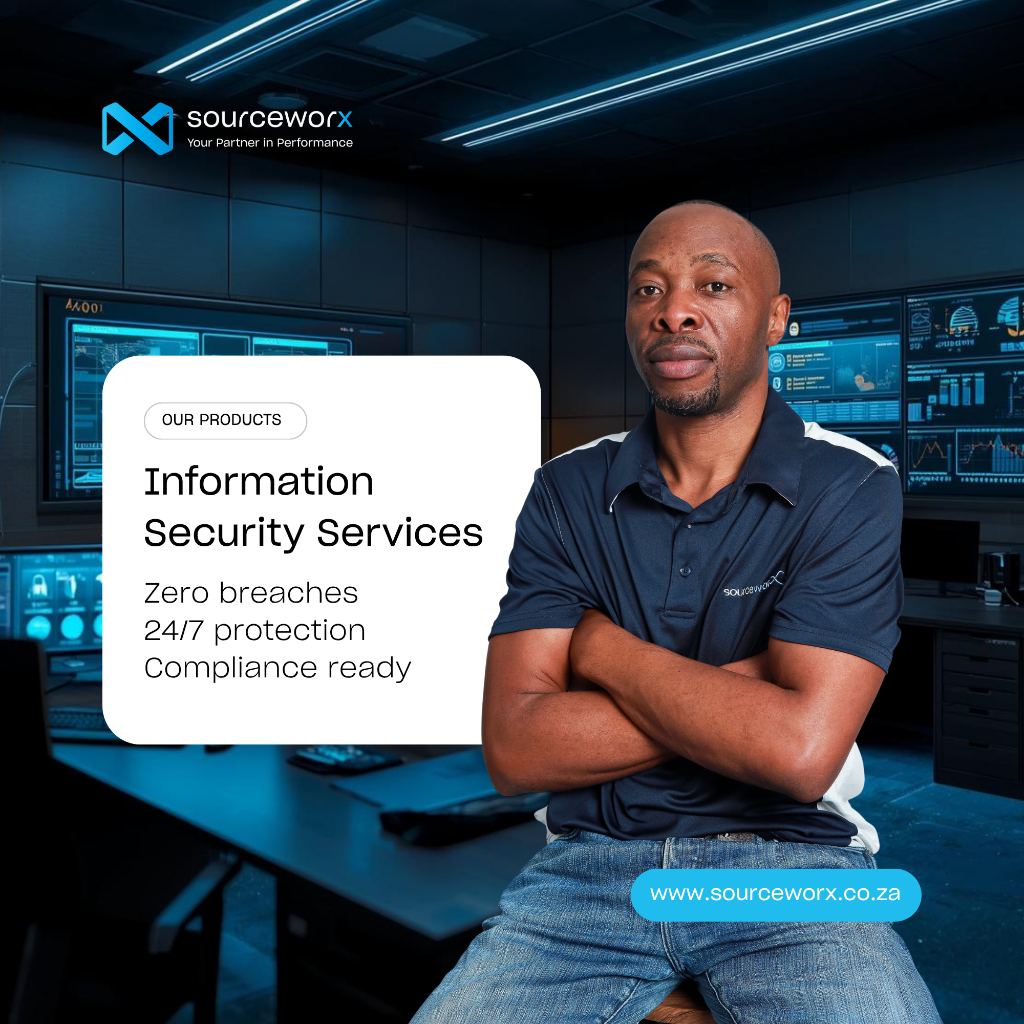 ✓ DO
✓ DOCorrect Product Post
- Brand colours — midnight navy + azure blue photography
- Sharp Grotesque / Inter typeface hierarchy respected
- White card text panel — clear content area, never over image
- Logo placed correctly top-left with full clearance
- Infinity mark used as background graphic element
- Precise, outcomes-led copy ("Zero breaches. 24/7 protection.")
- URL pill badge — bottom-right, consistent placement
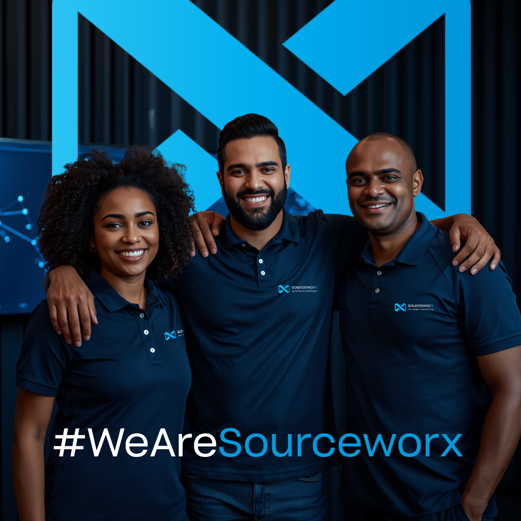 ✓ DO
✓ DOCorrect Brand Culture Post
- Infinity X mark used large as a hero graphic element
- Brand-consistent team apparel — midnight navy branded polos
- Dark blue brand photography environment
- Clean, single-font typography — no mixed styles
- Colour contrast: white text on dark background only
- Brand hashtag with azure blue accent on key word
- No logo clutter — mark does the brand work
Never Do This — Prohibited Execution
 ✗ NEVER
What's Wrong With This Design
Stock & AI-Assisted Imagery
Approved visual styles in Sourceworx brand colours — featuring our signature vertical wooden panel environment with blurred bokeh backgrounds, azure blue and midnight navy colour grades.
Canva & AI Image Prompts
Use these detailed prompts in Canva AI, Midjourney, Adobe Firefly, or any AI image generator to create on-brand photography.
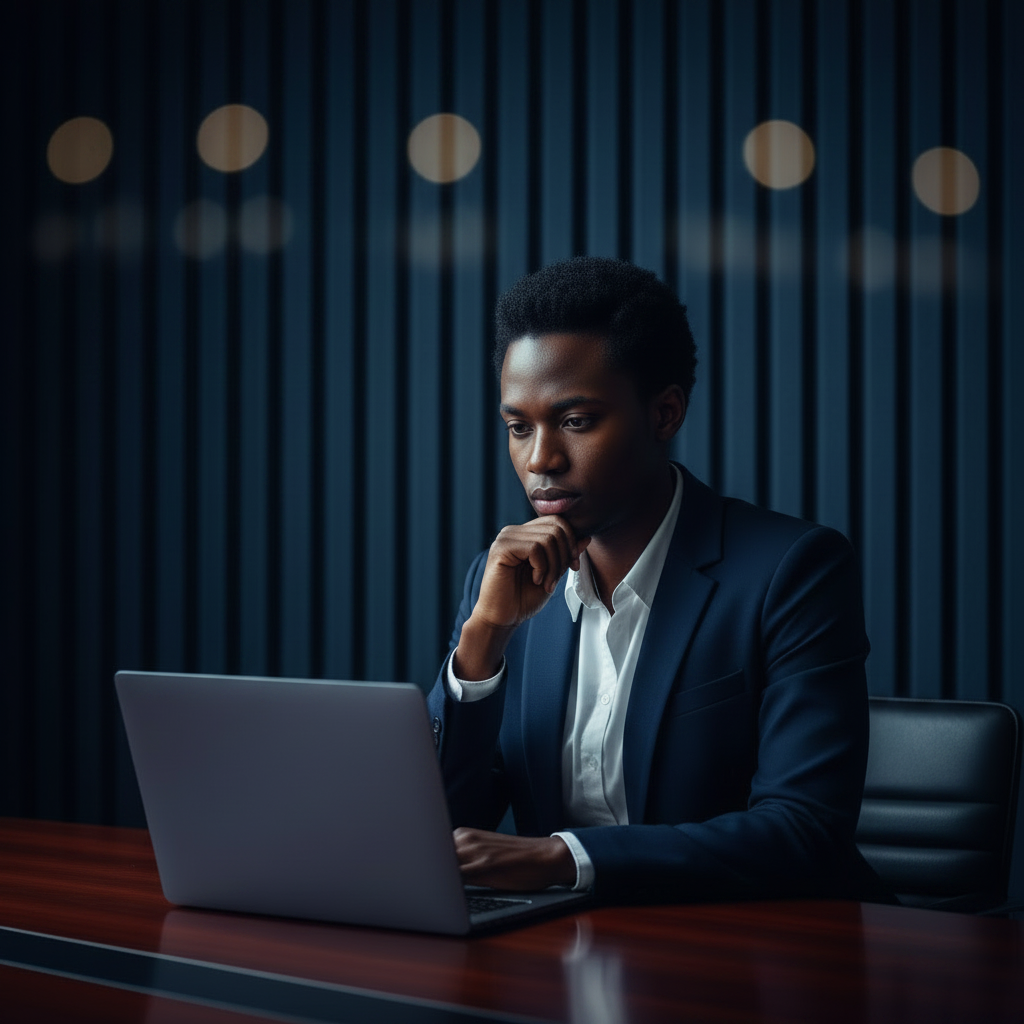
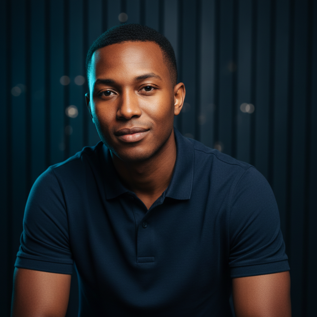
Hyper-realistic corporate editorial photography. African professional seated at a premium dark-stained standing desk. Subject wearing a Sourceworx midnight navy (#00213F) polo shirt with a discreet embroidered chest logo. Background: dark midnight navy (#00213F) vertical slatted acoustic wall panels, deeply blurred at f/1.4 bokeh. Lighting: cool azure blue (#009BDF) key light from the left, mimicking screen glow from an off-camera monitor. Deep navy shadows on right side of face. One or two ultrawide curved monitors visible in the blurred background showing blue network topology UI. Warm African skin tones. Shot on Sony A7III, 85mm f/1.4, ISO 800. Cinematic colour grade.
Hyper-realistic editorial photography. Three diverse South African IT professionals — two women and one man — gathered around a dark boardroom table covered with open laptops showing azure blue (#009BDF) analytics dashboards. All subjects wearing matching Sourceworx midnight navy (#00213F) polo shirts. Background: dark navy (#00213F) vertical slatted acoustic panels, blurred f/1.8 bokeh. Lighting: cool azure blue ambient from multiple laptop screens, deep navy fill shadows. No text overlays. Shot on Canon R5, 35mm f/1.8.
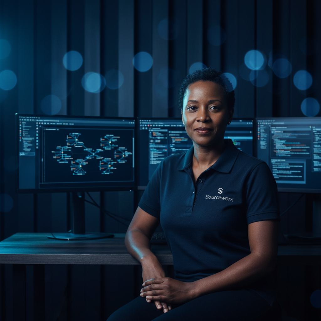
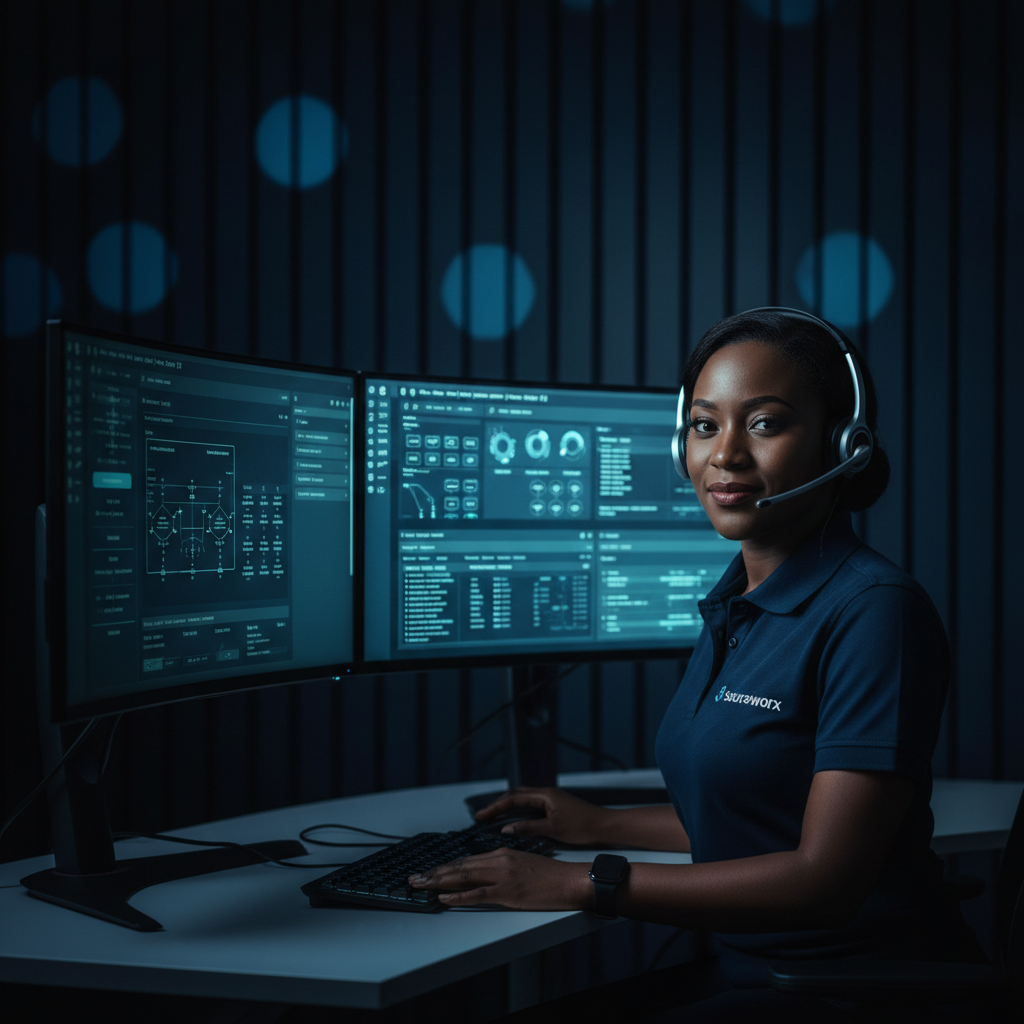
Hyper-realistic corporate photography. African IT professional woman in a Sourceworx midnight navy (#00213F) polo shirt seated at a premium help desk workstation. Two ultrawide curved monitors displaying Sourceworx-branded azure blue (#009BDF) IT Service Management (ITSM) dashboards — showing open tickets, SLA timers, live server statuses. Professional headset on. Background: dark midnight navy (#00213F) vertical slatted wall panels, sharply blurred f/1.8. Azure blue screen glow illuminates her face. Clean minimalist desk. Shot 50mm.
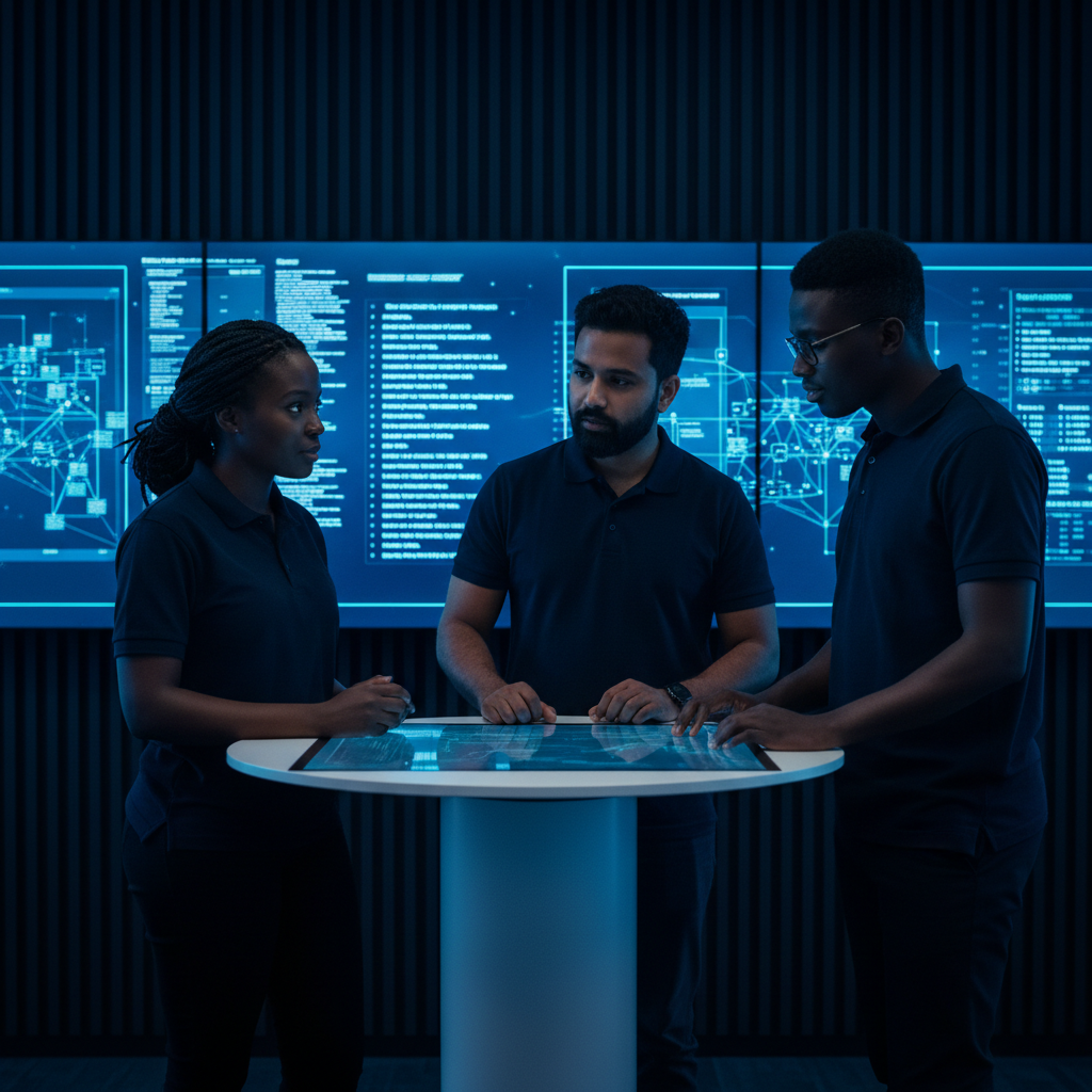
Hyper-realistic wide-angle corporate photography. Diverse team of 3–4 South African IT professionals in a Network Operations Centre (NOC). All wearing Sourceworx midnight navy (#00213F) polo shirts. Large wall-mounted screens behind them displaying live network maps, server health dashboards, azure blue (#009BDF) incident monitoring UI. Dark room — primary light source is azure blue from screens. Cinematic colour grade. Shot on Canon R5, 24mm f/2.8. No text overlays.
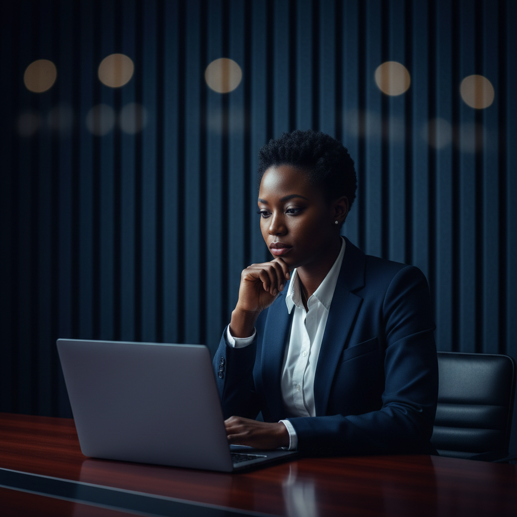
Hyper-realistic cinematic portrait photography. African female executive in a sharp midnight navy (#00213F) structured blazer over a crisp white shirt, seated at a dark boardroom table, hands clasped, looking directly into camera with calm authority. Background: dark midnight navy (#00213F) vertical slatted acoustic panels, ultra-smooth f/1.2 bokeh. Azure blue (#009BDF) rim light traces the left shoulder and jaw. Warm skin tones. Premium editorial style. Shot on Sony A7III, 85mm f/1.2.
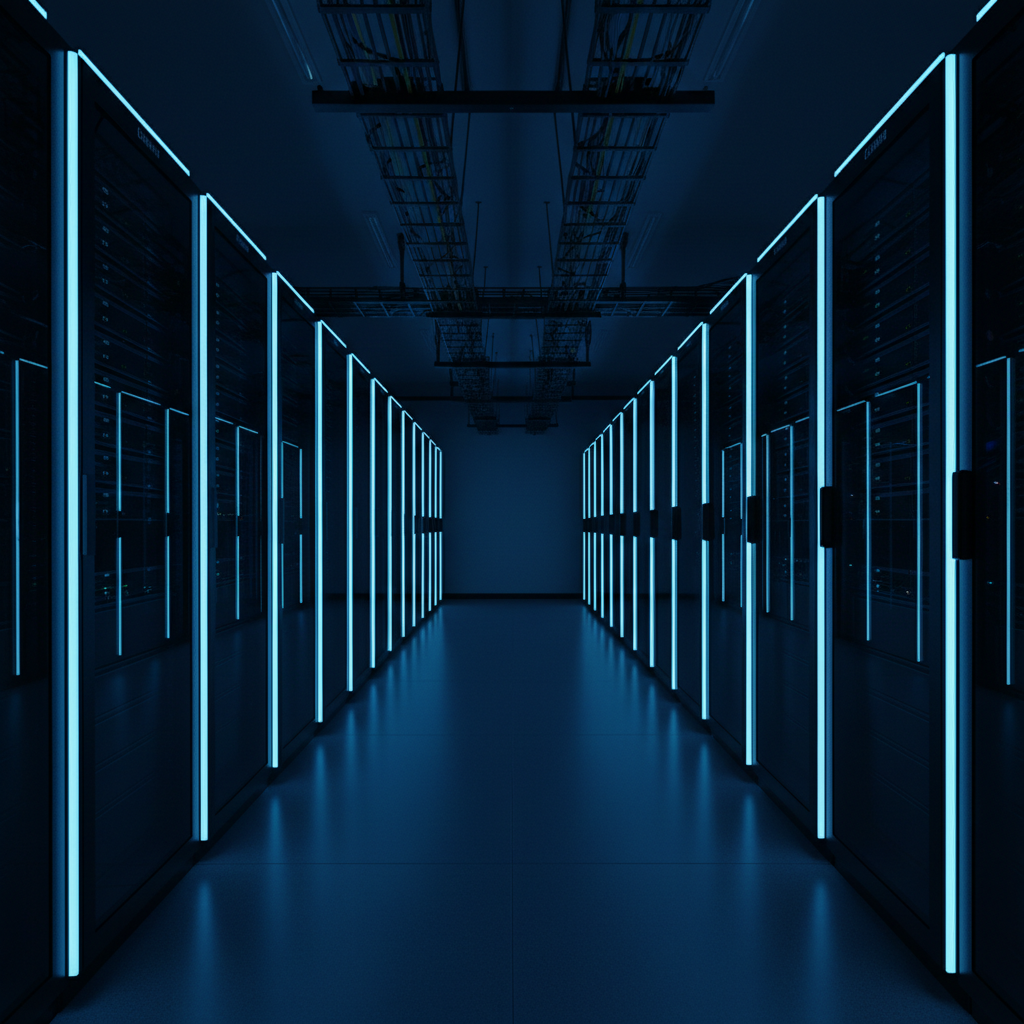
Hyper-realistic architectural photography. Premium enterprise data centre server room. Long corridor perspective: rows of 42U server racks, cable management trays with sorted navy and azure blue cables, enterprise switches with azure blue (#009BDF) LED port indicators. Ambient room light: deep midnight navy (#00213F). Azure blue LED accent strips creating parallel blue light trails in perspective. No people. Ultra-clean. Deep focus f/8. Shot on Canon R5, 24mm. No text, no logos.
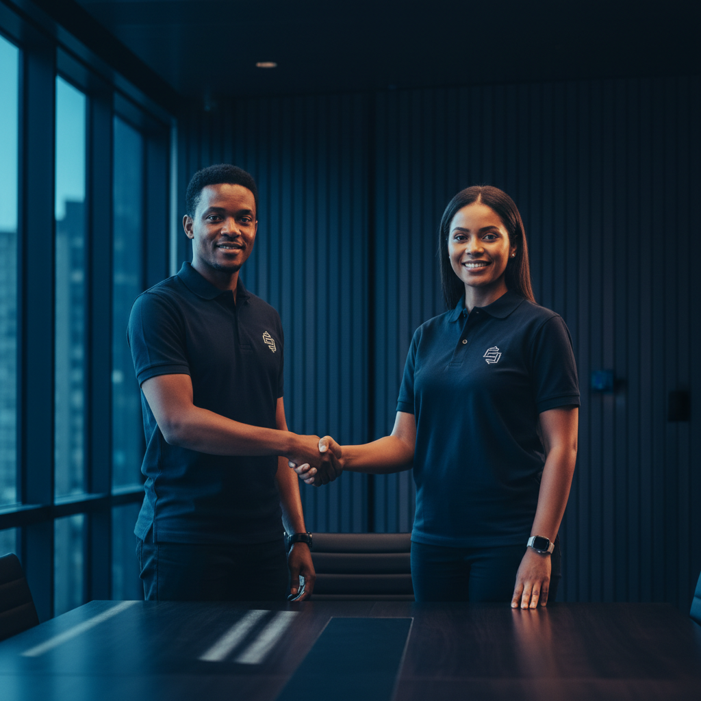
Hyper-realistic corporate editorial photography. Two South African professionals shaking hands firmly across a dark boardroom table. Both wearing Sourceworx midnight navy (#00213F) polo shirts. Mid-ground: open laptops with azure blue (#009BDF) business proposal UI on screens. Background: dark midnight navy (#00213F) vertical slatted panel feature wall, blurred f/1.8 bokeh. Azure blue ambient light from laptop screens. Cinematic grade. Shot on Sony A7III 50mm f/1.8. No text.
Hyper-realistic corporate editorial photography. African professional man in Sourceworx midnight navy (#00213F) polo shirt leaning slightly toward a laptop, focused on screen. Laptop screen: azure blue (#009BDF) code editor or network configuration interface. Background: dark midnight navy (#00213F) vertical slatted acoustic panel wall, blurred f/1.4 bokeh. Azure blue screen glow illuminates face and hands. Premium mechanical keyboard, minimalist dark desk setup. Shot on Sony A7III 85mm f/1.4.
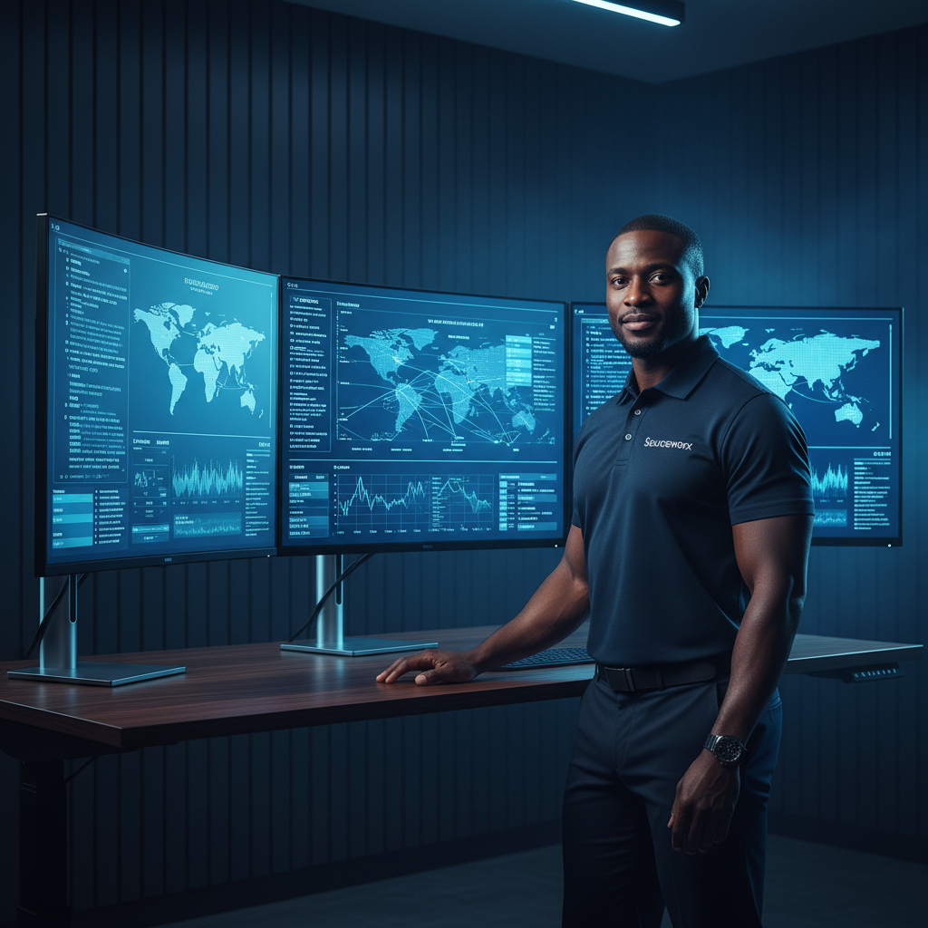
Hyper-realistic corporate editorial photography. African male IT engineer in Sourceworx midnight navy (#00213F) polo shirt standing confidently at a height-adjustable desk, arms crossed. Three ultrawide curved monitors showing azure blue (#009BDF) network topology dashboard, server monitoring metrics. Background: dark midnight navy (#00213F) vertical slatted wall panels, deeply blurred f/1.4. Server rack partially visible to the right. Shot on Canon R5 50mm. No text overlays.
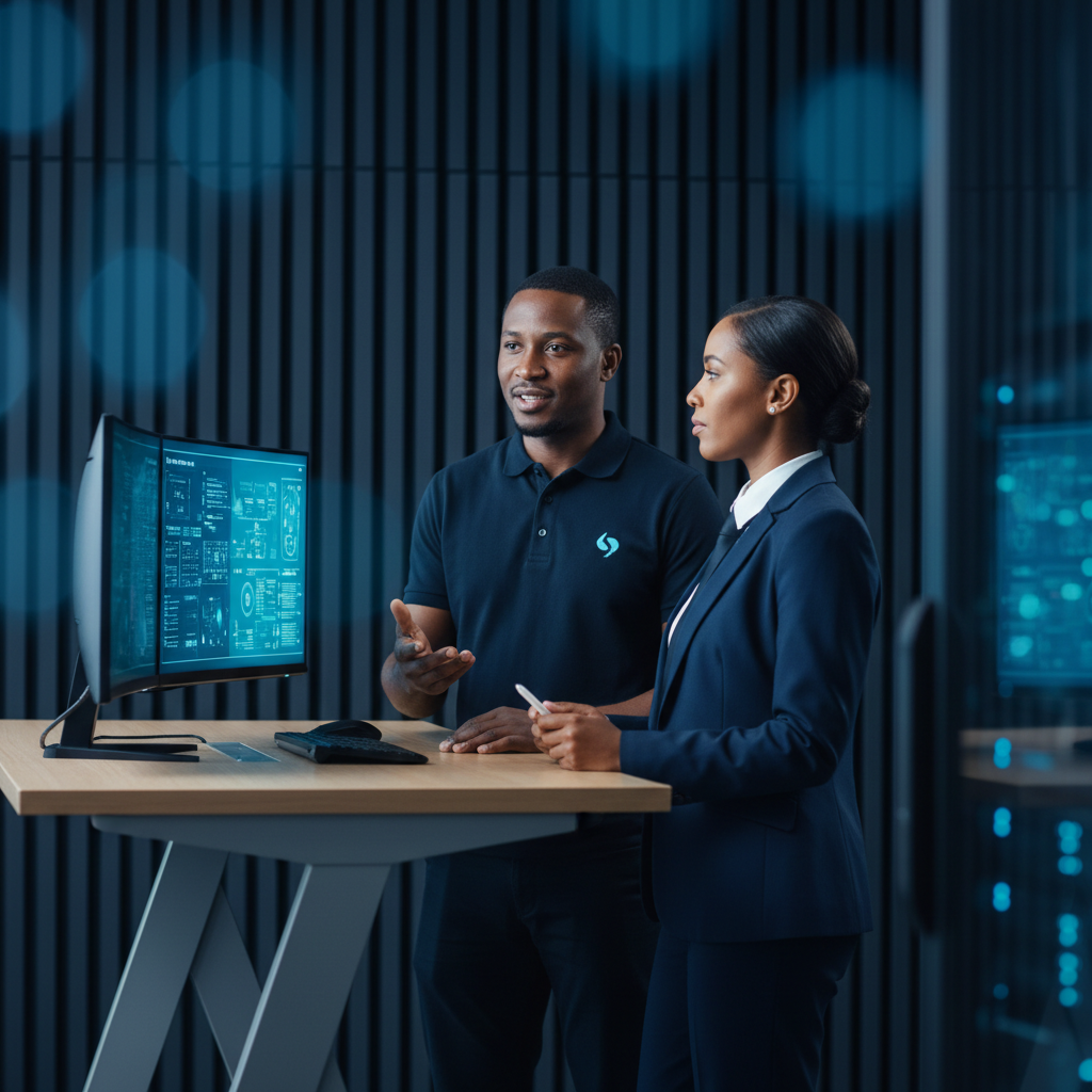
Hyper-realistic corporate editorial photography. Two South African professionals in a consultation at a boardroom table — one in a Sourceworx midnight navy (#00213F) polo shirt (the IT consultant), one in a navy business suit (the client). Consultant pointing at an open laptop screen showing azure blue (#009BDF) infrastructure diagram. Background: dark midnight navy (#00213F) vertical slatted panel feature wall, blurred f/1.8. Cinematic grade. Shot 50mm f/1.8. No logos.
Mandatory Visual DNA
Panel Colour
Dark midnight navy (#00213F) vertical slatted panels — always blurred bokeh behind the subject.
Attire
All people wear Sourceworx midnight navy (#00213F) polos, branded jackets, or navy business suits.
Colour Grade
Midnight Blue #00213F shadows + Azure Blue #009BDF screen or ambient accents on every shot.
Depth of Field
Shallow — f/1.4–f/2.8. Subject sharp, navy panels and background always soft and blurred.
Lighting
Azure blue screen or monitor glow as key light. Deep navy fill shadows. No harsh flash.
Tech Context
Always include tech props: monitors with blue UI, server racks, laptops, headsets, dashboards.
Lens
50mm–85mm equivalent. Cinematic portrait perspective — never wide angle distortion.
No Overlays
No text, no logos, no UI mockups on the photo itself. Keep images clean and pure.
Social Media & Website
Every pixel is intentional. Modern sophistication with dynamic energy — consistent rounded edges, seamless micro-interactions, and a design language as precise as our brand promise.
Everything aligns to the logo. No exceptions.
The Sourceworx visual framework is anchored by a single invisible rule: every element on every page shares the same left-edge grid line as the logo in the navigation bar.
The Rule — Memorise It
max-width: 1280px (max-w-7xl)
padding-left: 24px (px-6)
padding-right: 24px (px-6)
margin: 0 auto
This container applies to the navbar, every page section, every hero block, and the footer. Nothing sits outside it.
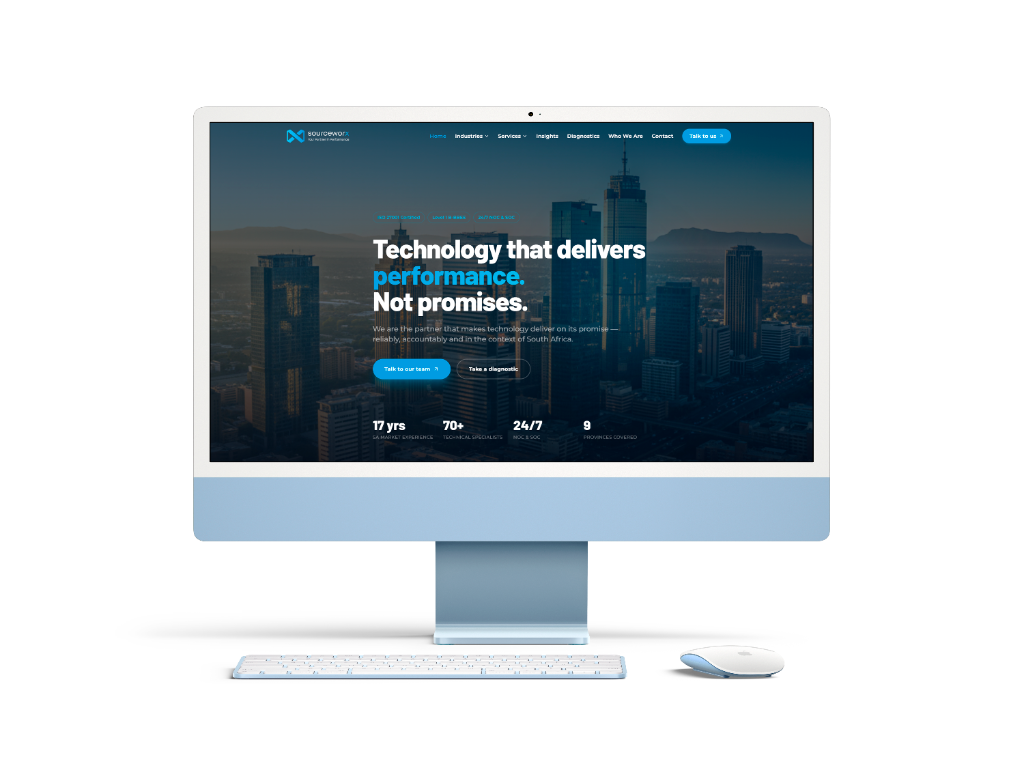
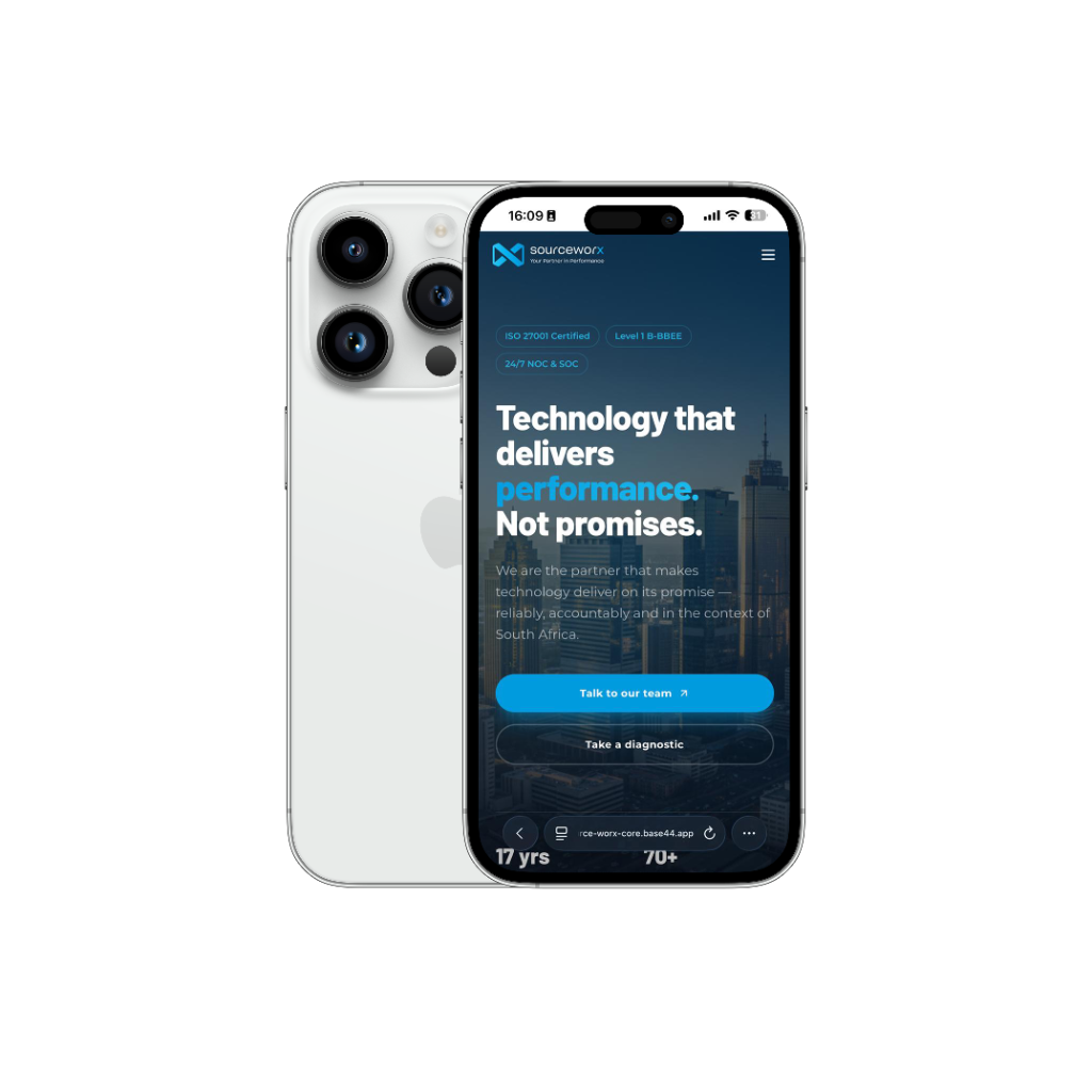
Technology that performs for South Africa.
Enterprise-grade managed IT. 17+ years. 70+ certified engineers. 24/7 NOC/SOC. Built for the realities of South Africa.
Website design language.
Modern sophistication with dynamic energy. The Sourceworx website is a proof of capability.
Cards: 16px. Images: 16px. Inputs: 8px. Buttons: 999px (pill). Section containers: 16–24px.
Section padding: 80px top/bottom (desktop). 40px (mobile). Between elements: 24–32px. Never compress.
Cards at rest: shadow-sm. Cards on hover: shadow-xl. Nav on scroll: shadow-sm.
All dark gradient backgrounds apply a 3–5% noise overlay. Prevents banding. Makes gradients feel premium.
Subtle and purposeful. No decorative animation. All motion communicates state or focus — never distraction.
People-first. African professionals. Navy panel bokeh. Azure screen glow. Never generic stock.
Every landing page follows this structure.
This is the blueprint for sourceworx.co.za and all campaign landing pages.
Inter. One typeface. Six roles.
All Sourceworx web and digital surfaces use Inter exclusively. Sharp, legible, and inherently modern — the rounded letterforms echo the infinity-infused X in the logo.
Inter · 700–800 · 56–80px · tracking: -0.02em
Your Partner in Performance.
Inter · 700 · 36–48px · tracking: -0.015em
Technology that performs for South Africa.
Inter · 600 · 20–28px · tracking: -0.01em
Managed IT · Cloud · Cybersecurity · NOC/SOC
Inter · 400 · 18–20px · tracking: 0
We combine deep technical expertise with strategic business insight.
Inter · 400 · 15–16px · tracking: 0
Sourceworx manages the technology environments that South African businesses cannot afford to lose.
Inter · 600 · 11–12px · tracking: 0.1em
MANAGED IT SERVICES · EST. 2007
Web Import
@import url("https://fonts.googleapis.com/css2?family=Inter:wght@300;400;500;600;700;800;900&display=swap");
CSS Variable
--font-inter: "Inter", system-ui, -apple-system, sans-serif;
Fallback Stack
font-family: var(--font-inter); /* system-ui fallback on slow loads */
60 · 30 · 10 — the digital colour rule.
Every web page, social post, email, and banner should reflect this ratio. Midnight Blue commands authority (60%). Azure Blue drives action (30%). Sky Blue provides energy and contrast (10%).
Midnight Blue — Primary 60%
#00213F · Backgrounds, text, nav, footer
Azure Blue — Secondary 30%
#009BDF · CTAs, links, accents, icons
Sky Blue — Accent 10%
#20BCED · Highlights, hover states, badges
Pure White
#FFFFFF · Page backgrounds, card surfaces, reversed text
Cloud White
#F8F8F8 · Section alternates, input backgrounds
Charcoal
#6A6A6A · Body copy, captions, secondary labels
Gradient Recipe — Digital Surfaces
background: linear-gradient(135deg, #00213F, #009BDF);
background: linear-gradient(135deg, #009BDF, #20BCED);
Image types. Formats. Rules.
Every image on the Sourceworx website and social channels must reinforce three things: people, performance, and precision.
Hero Images
African professionals in Sourceworx navy polos. Dark slatted panel background blurred bokeh. Azure blue screen glow. 85mm f/1.4 portrait perspective.
Section Backgrounds
Midnight navy to transparent gradients with subtle noise texture. Never flat colour. Always directional — top-to-bottom or diagonal.
Social Posts (1:1)
1080×1080px. White card or navy gradient. Brand X watermark corner. Logo top-right or bottom-left. No more than 2 typefaces per post.
LinkedIn Cover
1584×396px. Dark navy gradient left. Brand positioning statement centred. Horizontal light logo top-right. Always export @2x.
Web Hero
Full-bleed 2560×1440px. Cropped to show person right-of-centre. Left half reserved for headline copy overlay. Azure blue rim light visible.
Icons & Illustrations
Lucide icon set (2px stroke, rounded caps). Brand blue fill variants. No gradients on icons — single colour only. Min 24px at 1× density.
Data Visualisations
Bar and line charts: midnight navy bars, azure blue accent highlight, cloud white background. No 3D effects. Labels in Inter 12px/600.
Video Thumbnails
Dark hero still frame + lower-third title card. Pill badge top-left with vertical label. Always include horizontal logo.
Approved Social Templates
Source-Zoom: All images apply a 1.05× scale on hover. Container must have overflow: hidden. Transition: transform 500ms ease-out.
Every hover is intentional.
Interactions signal quality. The Sourceworx interaction system is restrained and purposeful — nothing animates unless it communicates.
Images scale to 1.05× on hover — slow ease-out (500ms). Never exceed 1.08×. Overflow hidden on container.
Pill CTAs translate -2px (Y) on hover + subtle box-shadow increase. Duration 200ms ease. Colour shifts azure → midnight.
White cards: shadow-md → shadow-xl on hover + -4px Y translate. Duration 300ms ease. Border stays visible.
Text links grow a 1px azure underline from left-to-right on hover. 200ms ease. Never show default underline at rest.
Active nav items: text-sw-azure. Hover: opacity 100% from 70%. No background highlight on desktop — pill dropdowns only.
All sections animate in: opacity 0→1, Y 30px→0, duration 600ms, ease-out. Once only. Stagger 70ms per child.
Numeric stats count up from 0 when scrolled into view. Duration 2000ms linear. Always show suffix (+ or %) from frame 1.
Dark → light sections: always use a hard edge (never gradient bleed). The contrast itself signals the narrative shift.
Live Demos — Hover Everything
All eight interaction patterns from the Sourceworx system — interactive and live.
01 · Button Lift
Pill CTA Buttons
Hover each button. Primary lifts + turns midnight. Outline fills azure. Ghost gets azure tint.
02 · Source-Zoom
Image Hover Zoom
Hover the image. 1.05× scale, 500ms ease-out. Container clips the overflow.
03 · Card Elevation
Card Hover Lift
Hover the card. Lifts -4px, shadow deepens to shadow-xl, 300ms ease.
Managed IT Services
24/7 monitoring and support for your entire technology environment.
04 · Link Underline
Animated Text Links
Hover each link. Azure underline grows left-to-right, 200ms ease. No underline at rest.
05 · Nav Highlight
Navigation Hover State
Services is active (azure). Hover the others — they shift from 50% deep to full azure, 200ms.
06 · Stat Counters
Animated Number Count
Numbers count from 0 on scroll into view, 2000ms. Once per session.
0+
Years SA
0+
Engineers
0/7
NOC/SOC
07 · Scroll Entrance
Fade In from Y+30px
Scroll down to hide this card, then scroll back up. It fades in from below, 600ms ease-out.
✓ Entrance animated
Scroll away and back to replay
08 · Section Transitions
Hard Edge Dark ↔ Light
Dark → light sections always use a hard edge. The contrast signals the narrative shift — no gradients between sections.
Numbers count up. Once. On scroll.
Fixed. 64px. White. Logo left.
The navigation bar is fixed, always white. The logo sits at the left edge of the max-w-7xl container — the same grid edge as every page headline.
Logo Specs
Nav Items
CTA Button
Navigation — Do
Logo always at the left edge of the max-w-7xl container.
Grouped dropdowns for 5+ nav items.
CTA button always present and right-aligned on desktop.
Add shadow-sm when user scrolls past 20px.
Mobile: full-screen overlay menu with grouped sections.
Navigation — Don't
Never centre the logo.
Never use a coloured navbar background.
Never remove the CTA pill button.
Never use a sidebar navigation on the marketing site.
Never hide nav items behind a hamburger on desktop.
Campaign landing pages — the blueprint.
Single goal. Single CTA. No navigation bar. Every campaign landing page follows a strict template to maximise conversion.
No Top Nav
Logo only (left-aligned) or logo + phone number. Remove all exit points except the CTA.
Single CTA
One conversion goal. One CTA colour, one button label, one form. Multiple options dilute conversion.
Vertical-Specific Copy
Use the correct vertical messaging block. Financial Services gets SARB language. Municipalities get MFMA language.
Trust Signals Above Fold
Logo, ISO badges, B-BBEE level, and "17+ years" must appear within the first screenful.
Social Proof
At least one client quote or case study result. Format: large pull-quote, company logo, person name/title.
UTM & Analytics
Every URL must carry UTM parameters. Track source, medium, campaign, and vertical. Fire a custom event on CTA click.
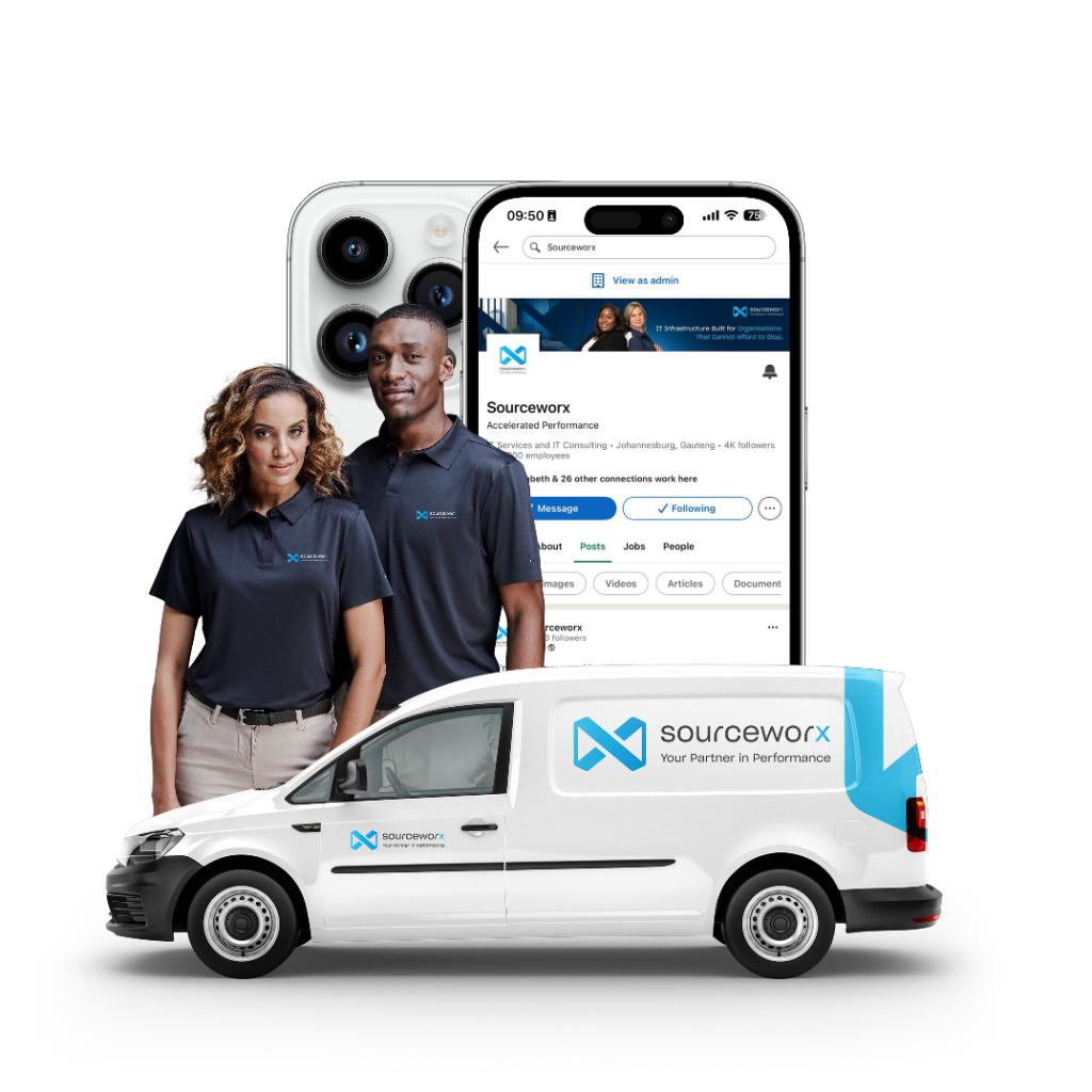
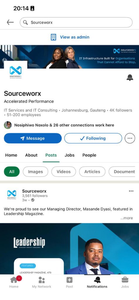
4K+ followers. Every post a brand touchpoint.
The Sourceworx LinkedIn page is the primary social brand asset. Every element follows the framework.
Profile Setup Standards
The order in which we build the case.
Every landing page must follow the P1→P2→P3 structure from the Sourceworx Brand Messaging Framework.
Technology that performs for South Africa.
The hero headline. Outcome-led. One clean sentence. State the transformational promise, not the service category.
Built-in compliance, 24/7 NOC, and 17+ years of SA-specific expertise.
The trust builder. Addresses the decision-maker's primary fear — "will this partner actually understand my environment?" — before it is asked.
ISO 27001 · ISO 9001 · Level 1 B-BBEE · Fortinet Authorised Partner.
The credentials closer. Never lead with these — they close the conversation, not open it.
Do. Don't. No grey area.
Always Do
Left-align all content to the same grid edge as the logo — max-w-7xl, px-6 padding.
Use Inter font across all web and digital surfaces — Bold for headlines, Regular for body.
Apply pill-shaped (border-radius: 999px) to all primary CTA buttons.
Use noise-texture gradients for dark section backgrounds — never flat solid colour.
Keep whitespace generous — minimum 80px vertical section padding on desktop.
Use the 60-30-10 rule: midnight blue dominant, azure secondary, sky blue accent.
Follow the P1→P2→P3 message hierarchy on every page and every ad format.
Never Do
Never mix left-aligned and centred text in the same section — pick one.
Never use more than 2 typefaces on a single page — Inter only for all UI text.
Never apply flat solid colour backgrounds — always gradient with noise texture.
Never put the logo on the right side or centred in the navbar.
Never use sharp-cornered buttons — all interactive elements must use rounded/pill.
Never lead with credentials — ISO certs and B-BBEE are P3 supporters, not headlines.
Never use stock images with non-African subjects or non-brand environments.
Six principles that govern every decision.
If a design decision cannot be justified by at least one of these six principles, it is wrong for Sourceworx.
Alignment is Trust
When everything aligns to the same grid — logo, headline, body, button — the brand feels precise and reliable. Misalignment signals carelessness.
Whitespace is Confidence
Premium brands breathe. Cramped layouts signal budget. Generous whitespace positions Sourceworx as an enterprise partner.
Outcome Over Feature
Headlines describe what the client gains, not what Sourceworx provides. "Technology that performs" beats "Managed IT Services" every time.
People Over Infrastructure
Images show African professionals succeeding — not server racks. The infrastructure is implied. The human impact is what resonates.
Motion Communicates
Every animated element serves a purpose — it signals state (hover), focus (entrance), or progress (counter). Decorative motion is never approved.
Specificity Builds Credibility
General claims erode trust. Name the regulation. Name the system. Name the result. "SARB-compliant monitoring" beats "enterprise security".
Brand Voice
How Sourceworx speaks — to engineers, to executives, and to the market. High-precision. Context-aware. Outcomes-led.

The Three Voice Pillars
Outcomes-Led
Communications must emphasise measurable outcomes over generic feature lists. Every claim must connect to a business result.
Examples
- "Reduced average response time to under 15 minutes"
- "30% average IT cost savings across client portfolios"
- "99.9% uptime delivered across managed environments"
Context-Aware
Solutions are specifically tailored for real-world African conditions such as load-shedding resilience, POPIA compliance, and B-BBEE requirements.
Examples
- "Built for Stage 6 load-shedding environments"
- "SD-WAN configured for South African last-mile realities"
- "POPIA-native data handling — not retrofitted compliance"
High-Precision Language
Use exact technical terminology with technical buyers. When speaking to executives, translate the technology into business outcomes.
Examples
- "CI/CD implementation with GitOps pipeline architecture"
- "Application-aware policy controls via SD-WAN overlay"
- "Zero-trust network access (ZTNA) with identity-based segmentation"
Voice Principles — How We Sound
Direct.
We say what we mean without filler. No "leveraging synergies". No "holistic ecosystems".
Confident.
17 years and 70+ technical specialists behind every claim. We do not hedge unnecessarily.
Warm.
We are professionals, not corporates. We write to people, not at organisations.
Specific.
Generalities erode trust. We name the regulation, the system, the use case.
"Speak to outcomes. Always."
✓ Say This
Measurable results / quantified outcomes
Built for South Africa / designed for African conditions
ISO-certified / POPIA-compliant processes
Named regulations (SARB, FSCA, MFMA, POPIA)
Specific metrics (< 15min response, 99.9% uptime)
Accountable, reliable, proven
✗ Never Say This
World-class (unless quoting a third party)
Cutting-edge or next-generation
Solutions provider or solutions company
End-to-end solutions (say what it actually is)
Disruptive or revolutionary
Best-of-breed technologies
Every word we write is accountable to our clients' outcomes.
Uniform & Apparel
Precision branding on fabric. Professional yet approachable. Team members as brand ambassadors.
Use Midnight Blue (#00213F) as the primary colour for all tops and outerwear. The Sourceworx logo is applied via embroidery only — left chest position.
Gender-Specific Cuts — Mandatory
Male team members wear male-cut apparel; female team members wear female-cut apparel.
Placement Rules
Primary — "The Heart". Horizontal logo. Embroidery only.
Secondary — "The Vision". Logo mark only.
No branding. Stone/khaki chino stretch — unbranded.
Embroidery vs Print
Embroidery ✓
All tops and outerwear. Premium, durable, approved.
Screen Print ✓
Casual / event wear only with written approval.
Heat Transfer ✗
Not approved — peels with washing.
Sublimation ✗
Not approved for standard uniform.
Men's Range
Male-cut apparel — mandatory for male team members in all client-facing roles.
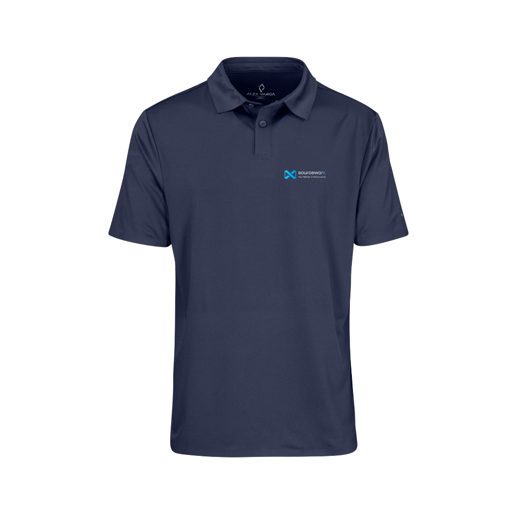
Golf Shirt
Embroidered left chest logo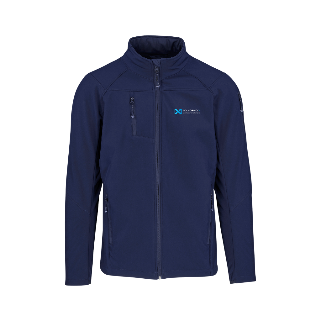
Softshell Jacket
Embroidered left chest logo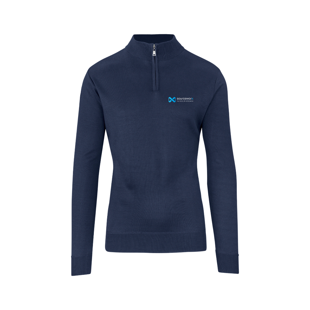
¼ Zip Jersey
Embroidered left chest logo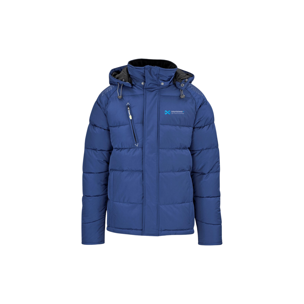
Puffer Jacket
Embroidered left chest logo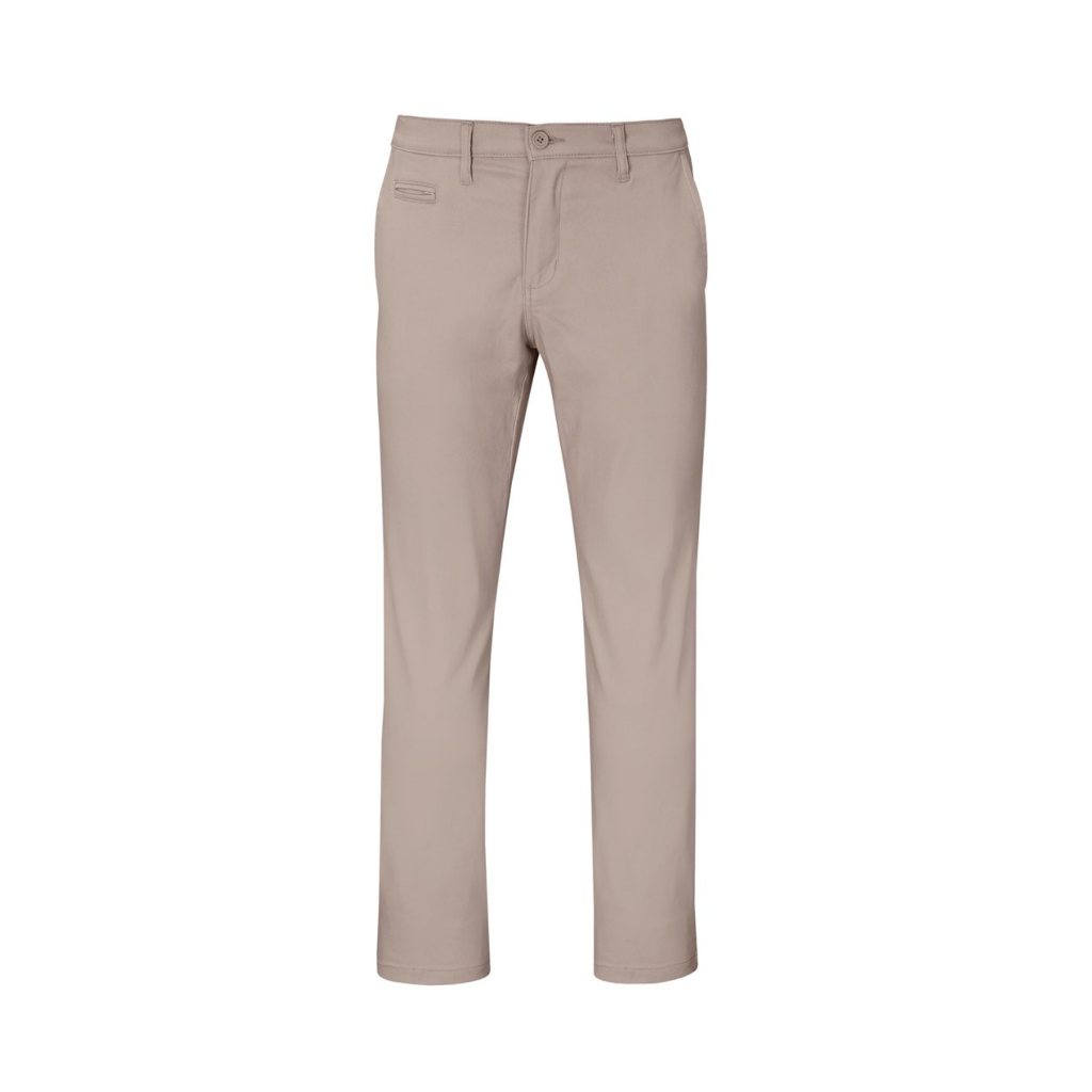
Chino Stretch Pants
No branding — stone / khakiWomen's Range
Female-cut apparel — mandatory for female team members in all client-facing roles.
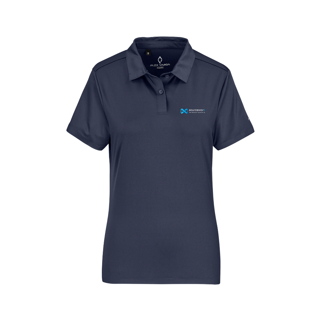
Golf Shirt
Embroidered left chest logo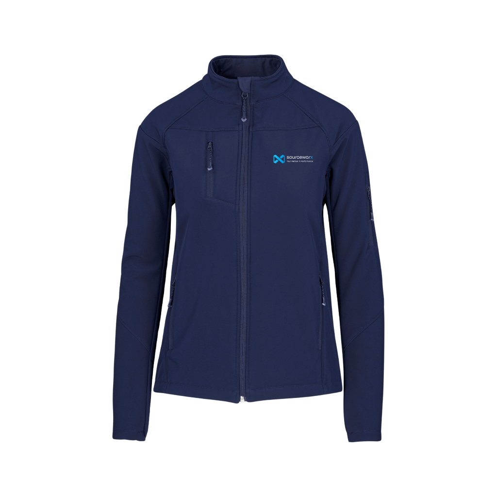
Softshell Jacket
Embroidered left chest logo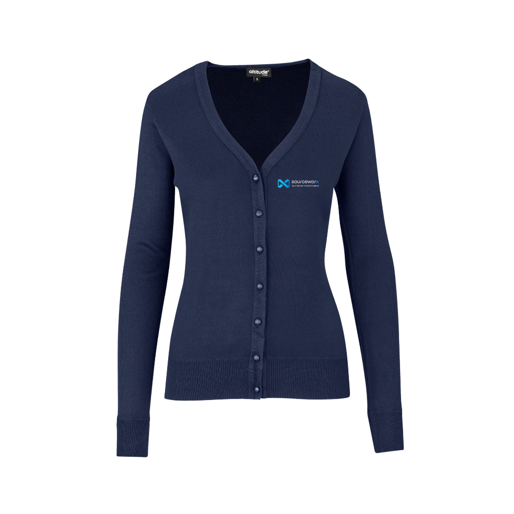
Cardigan
Embroidered left chest logo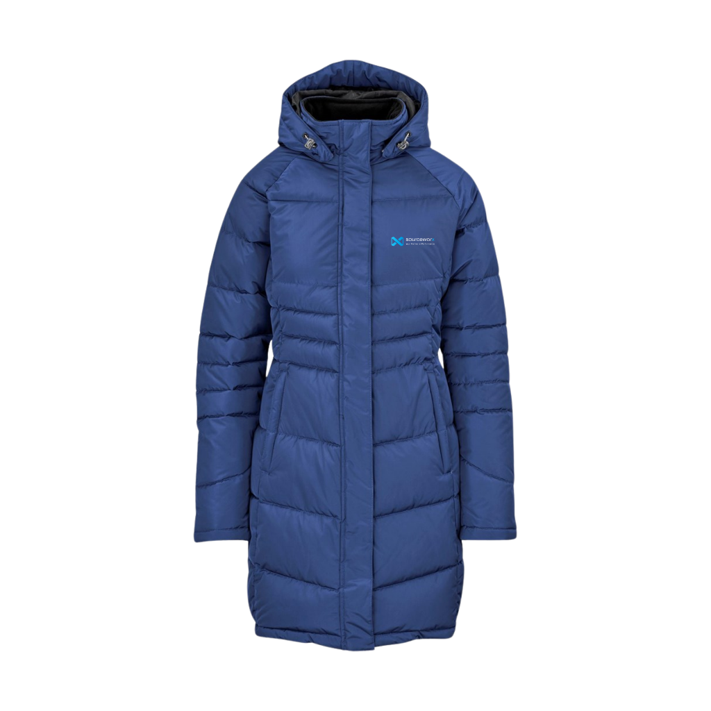
Puffer Jacket
Embroidered left chest logo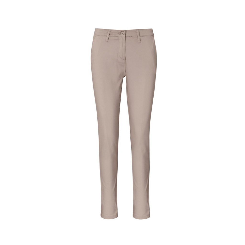
Chino Stretch Pants
No branding — stone / khakiVehicle Branding
Cost-effective precision branding that transforms company vehicles into mobile brand ambassadors.
Adopt a subtle, cost-effective approach to vehicle branding. For optimal brand visibility, prioritise white or blue vehicles that complement our colour palette. Apply the Sourceworx logo mark strategically on doors, tailgates, or rear windows using high-quality vinyl decals.
For darker coloured vehicles, use the alternate white or light version of the logo. This minimalist approach delivers strong brand visibility while significantly reducing application and maintenance costs compared to full vehicle wraps.
Application Guidelines
White vehicle
Use Dark logo (Horizontal) · Doors — centred
Blue vehicle
Use Light logo (Horizontal) + tagline · Door centre + rear tailgate
All vehicles
Include "Your Partner in Performance" · Under logo mark
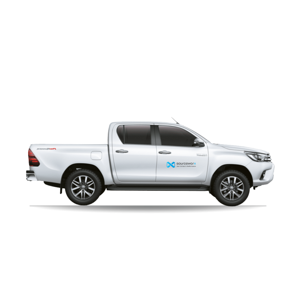
White Vehicle — Dark Logo on Door
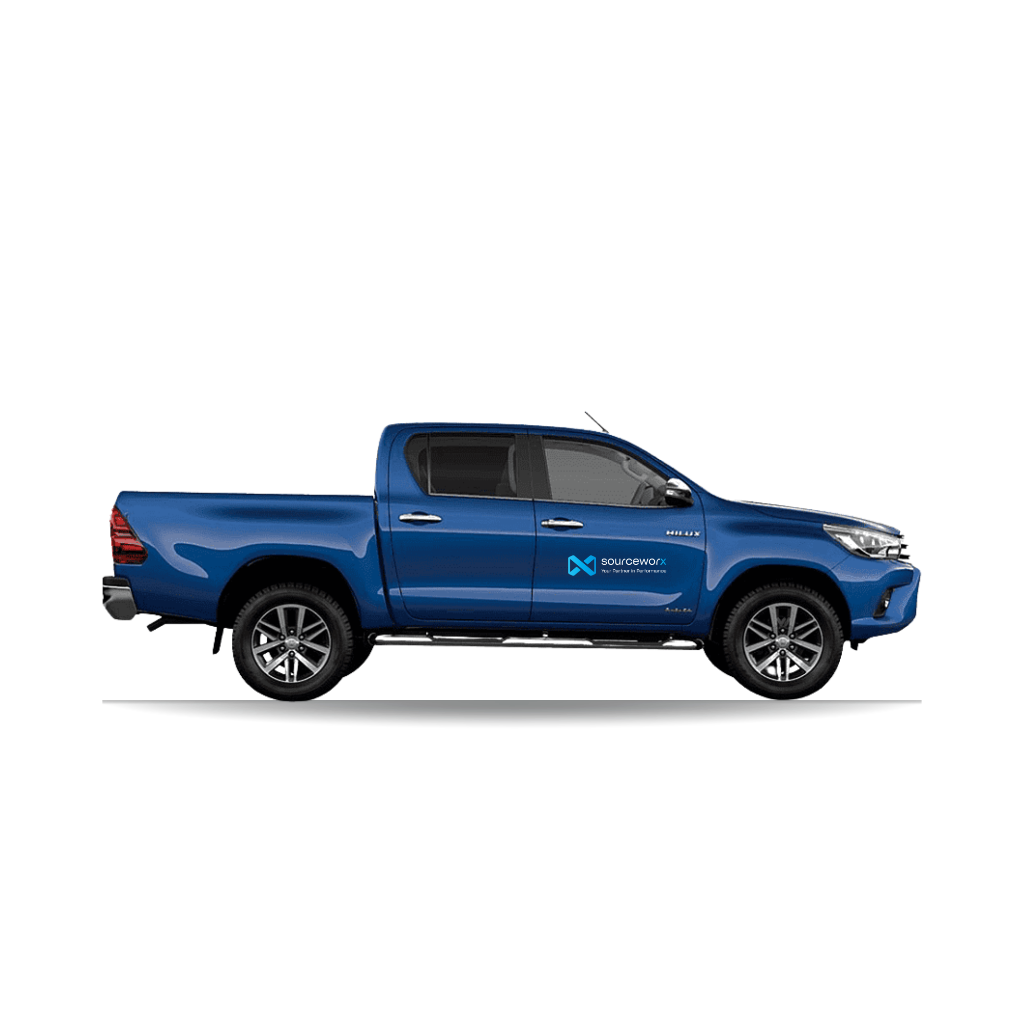
Blue Vehicle — Light Logo + Tagline
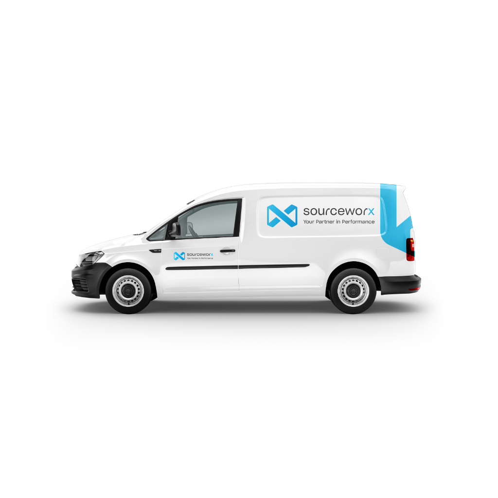
VW Caddy — Side Profile with Partial Wrap
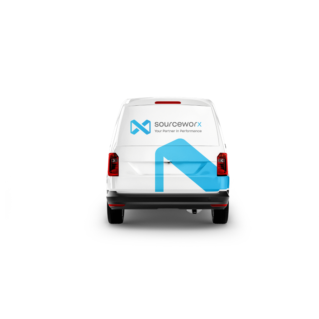
VW Caddy — Rear with X Mark Graphic
Partial Wrap Architecture
For premium wrap applications: 40% of the vehicle (the rear section) is wrapped in Midnight Blue with the Sourceworx "X" mark scaled to overflow the rear edges, while the front remains in the vehicle's original colour for a high-velocity, dynamic contrast look.
Branded Display
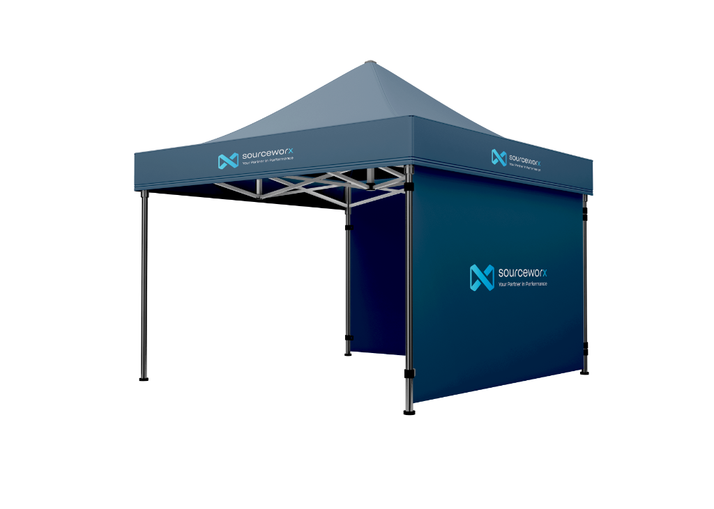
Gazebos, flags, banners and exhibition materials — outdoor vs indoor rules for colour background selection.
Indoor Display Materials
White or dark — both acceptable indoors, as long as brand colours are maintained.
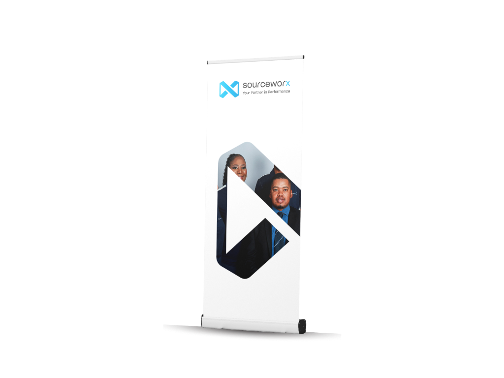
Roller Banners
White OR Dark backgroundControlled environment. Either background works if brand colour proportions (60-30-10) are respected.
Reception Banners
Light preferredClean, professional first impression. Matches typical office interior palettes.
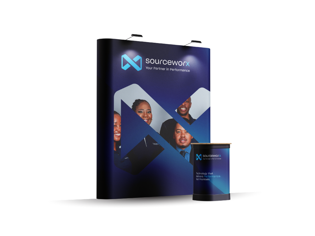
Conference Booth Backdrops
Dark gradient + noise textureCommanding presence in conference environments. The noise gradient creates premium cinematic quality.
Indoor — White Background
Your Partner in Performance
Indoor ✓Indoor — Dark Gradient
Your Partner in Performance
Indoor ✓Branded Display Examples
Brand Standards for Display Materials
Every branded display item must uphold these standards without exception.
✓ Always Do
Use the current official Sourceworx logo — always sourced from the brand team
Ensure the logo contrasts strongly against its background for maximum visibility
Use the light (white) logo on dark backgrounds; use the dark logo on light backgrounds
Adhere to brand colours: Midnight Blue (#00213F), Azure Blue (#009BDF), Sky Blue (#20BCED)
Use only high-resolution photography — minimum 300 DPI for print production
Follow the 60-30-10 colour distribution rule across all display materials
✗ Never Do
Do not use the old Sourceworx logo or any unofficial logo variants
Do not stretch, squash, skew, rotate, or distort the logo in any way
Do not recolour, apply gradients to, or add effects to the logo
Do not use low-resolution, pixelated, or compressed images on branded display
Do not use off-brand colours, gradients, or typefaces not specified in the brand guidelines
Do not crowd the layout — white space and intentional placement are essential
Supplier Specifications & Production Notes
This section is for suppliers appointed to manufacture branded display materials. All production must adhere to these specifications to maintain brand integrity.
File Format
Always request AI or PDF (vector) files from the brand team. Never scale raster images for large-format print.
Colour Mode
All print production must use CMYK values as specified in the Brand Colours section. Request colour proofs before full production.
Minimum Logo Size
Logo mark minimum 25mm on any printed material. Horizontal logo minimum 60mm width.
Clear Space
Maintain clear space equal to the logo mark height on all four sides of the logo at all times.
Material Specification
Outdoor materials: UV-resistant inks on 440gsm PVC or comparable. Indoor: 200gsm+ matt or gloss as appropriate.
Proof Approval
All proofs must be approved by the Sourceworx Marketing Team before production commences. No exceptions.
Logo in Spaces
Physical environments where the Sourceworx brand lives — from reception to the road.
Our logo should be prominently displayed in physical environments to reinforce brand presence and create a cohesive experience.
Reception Areas
Floating Glass execution — laser-cut acrylic mounted 20mm off the wall with LED backlighting creating a premium shadow-gap effect. Min. size: 600mm width.
Meeting Rooms
Frosted vinyl on glass partitions. Logo mark only (no wordmark). Min. size: 200mm. Positioned top-left of partition at eye height.
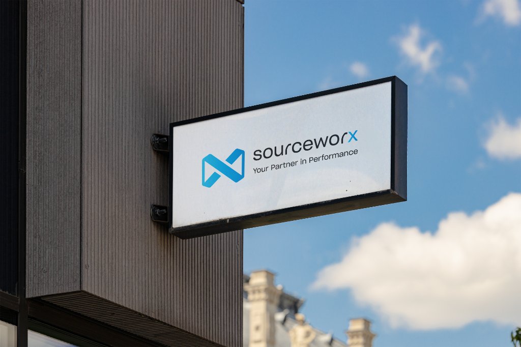
Directional Signage
Black placard with horizontal light logo. Arrow directional element aligned left. "Your Partner in Performance" tagline beneath.
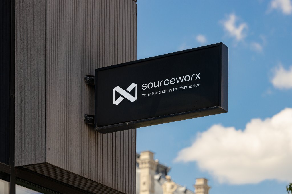
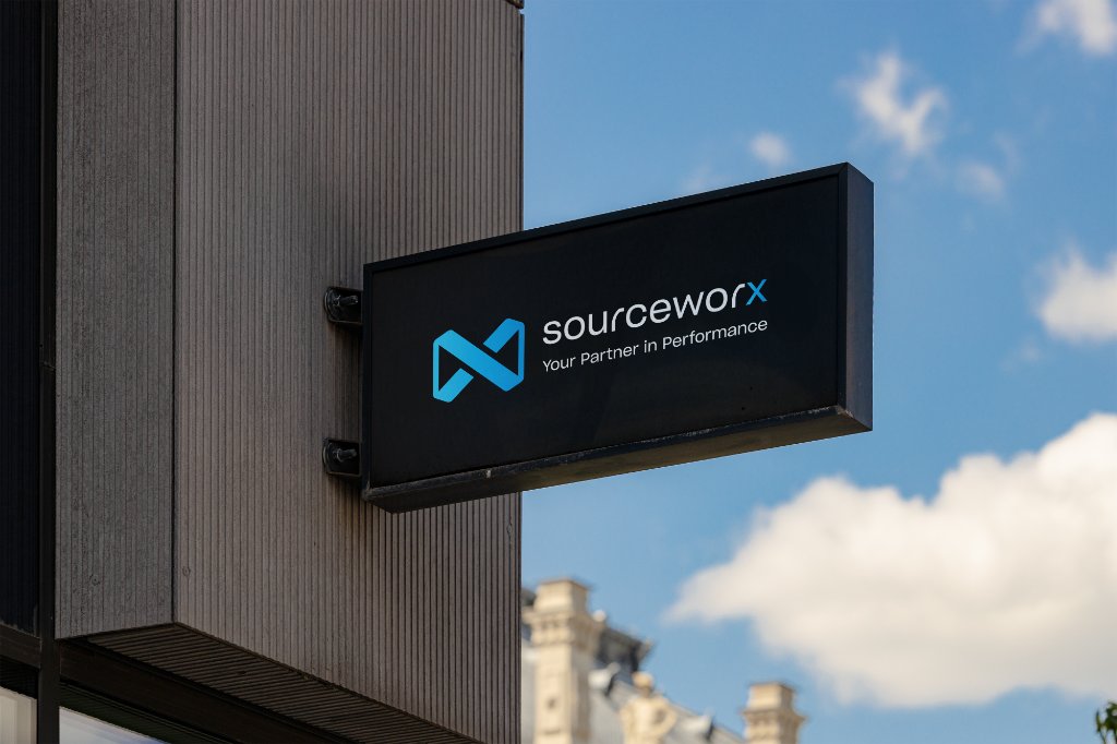
Building / Pylon Signage
Logo mark + wordmark on branded panel. High contrast — logo must always be clearly readable against background.
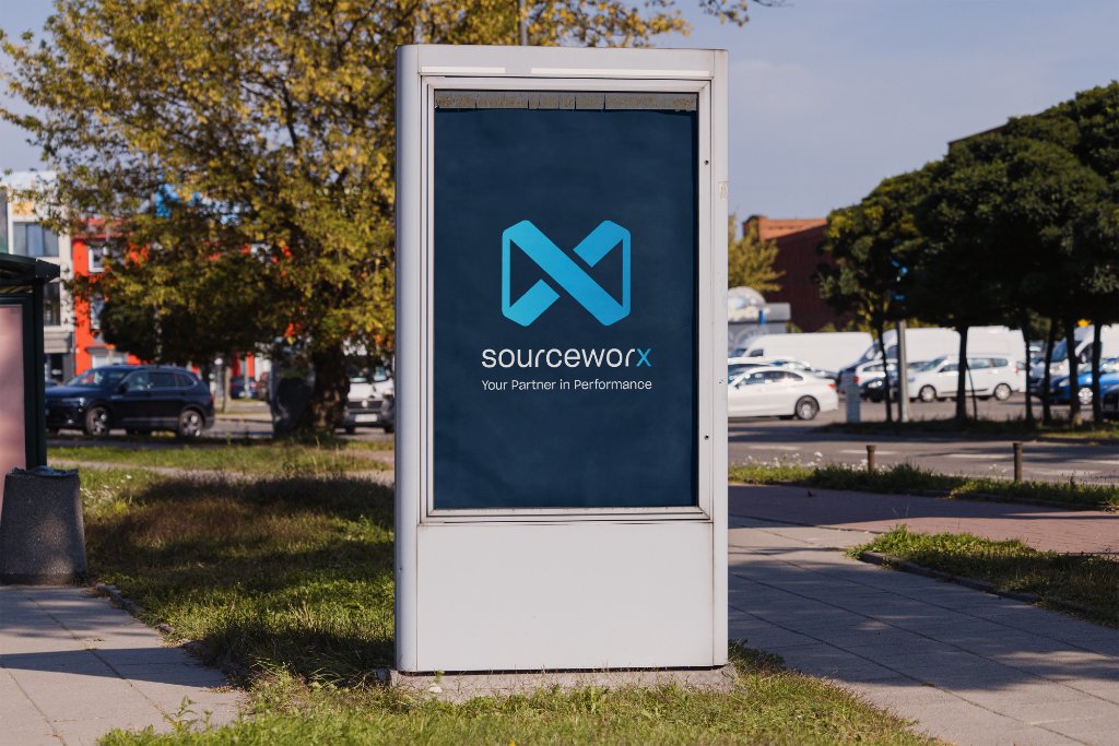
Exhibition Stands
See Branded Display guidelines. Conference booth backdrop — dark gradient with noise texture.
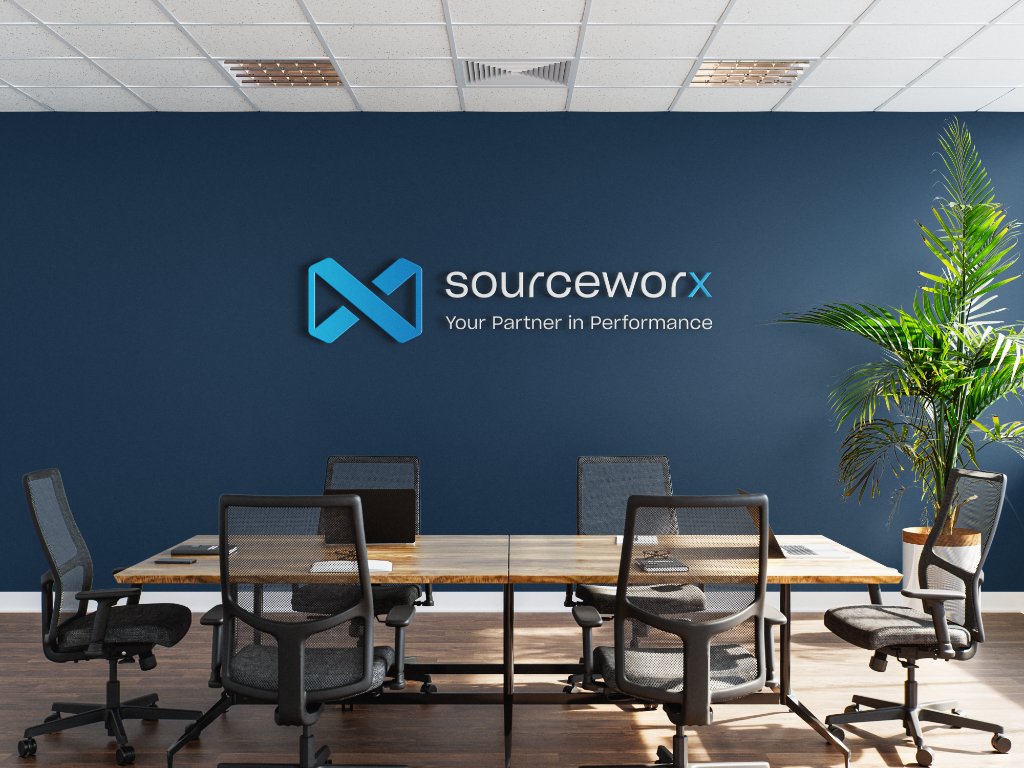
Workspace Walls
Brand statements or the mission/vision in oversized typography on feature walls. Use Midnight Blue wall colour where budget allows.
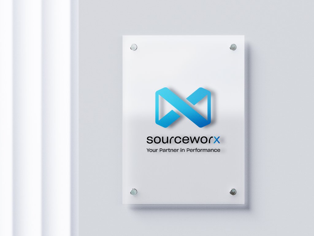
Floating Glass Standard
In office environments, the preferred logo application is "Floating Glass" — laser-cut acrylic mounted 20mm off the wall surface with concealed LED backlighting. This creates a premium shadow-gap effect that communicates precision and sophistication. All logo files for acrylic cutting must be sourced as AI vector files from the Sourceworx Marketing Team.
Iconography
Clean, minimal line-stroke icons — consistent weight, on-brand colour, always optically centred.
IT Services
Operations
Business & Compliance
Communication & Contact
Projects & Delivery
Icon Usage Guidelines
Style
Clean, minimal line-stroke icons at 1.5px weight. No filled icons.
Light Backgrounds
Use Midnight Blue (#00213F) or Azure Blue (#009BDF).
Dark Backgrounds
Use Sky Blue (#20BCED) or White (#FFFFFF).
Sizing
Minimum 24px, recommended 32px, maximum 48px. Always optically centred.
Library
Lucide Icons is the approved icon library for all digital applications.
Accessibility
All interactive icons must have aria-label attributes. Focus ring: Sky Blue #20BCED.
Download Centre
Official brand assets, logos, fonts, photography and templates — ready to download and use.
Logo Assets
3 assetsHorizontal Logo — Dark
Dark version on white/light backgrounds. PNG with transparency.
Horizontal Logo — Light
White version for dark backgrounds. PNG with transparency.
Favicon / Logo Mark
Square icon mark only. For favicons, app icons, profile photos.
Fonts & Typography
Plus Jakarta Sans — Variable Font
Primary brand typeface. All weights (300–800). Google Fonts open licence.
Inter — Variable Font
Secondary / UI typeface. All weights. Google Fonts open licence.
Additional Assets
Photography, AI Imagery, EPS & SVG Files
For access to team photography, AI-generated brand imagery, high-resolution EPS vector files, SVG assets, and other brand materials — please contact the Sourceworx Marketing Department directly.
communications@sourceworx.co.za
Icon SVG Files
24 iconsDownload individual icon SVG files in brand colours for use in presentations, documents, and designs.
Usage Guidelines
Brand Integrity
Never alter, distort, or recolour the Sourceworx logo. Use only approved colour versions.
Authorised Use Only
Assets are for official Sourceworx communications only. Not for third-party use without written approval.
Need Something Else?
Contact communications@sourceworx.co.za for additional assets, high-res files or custom requests.